
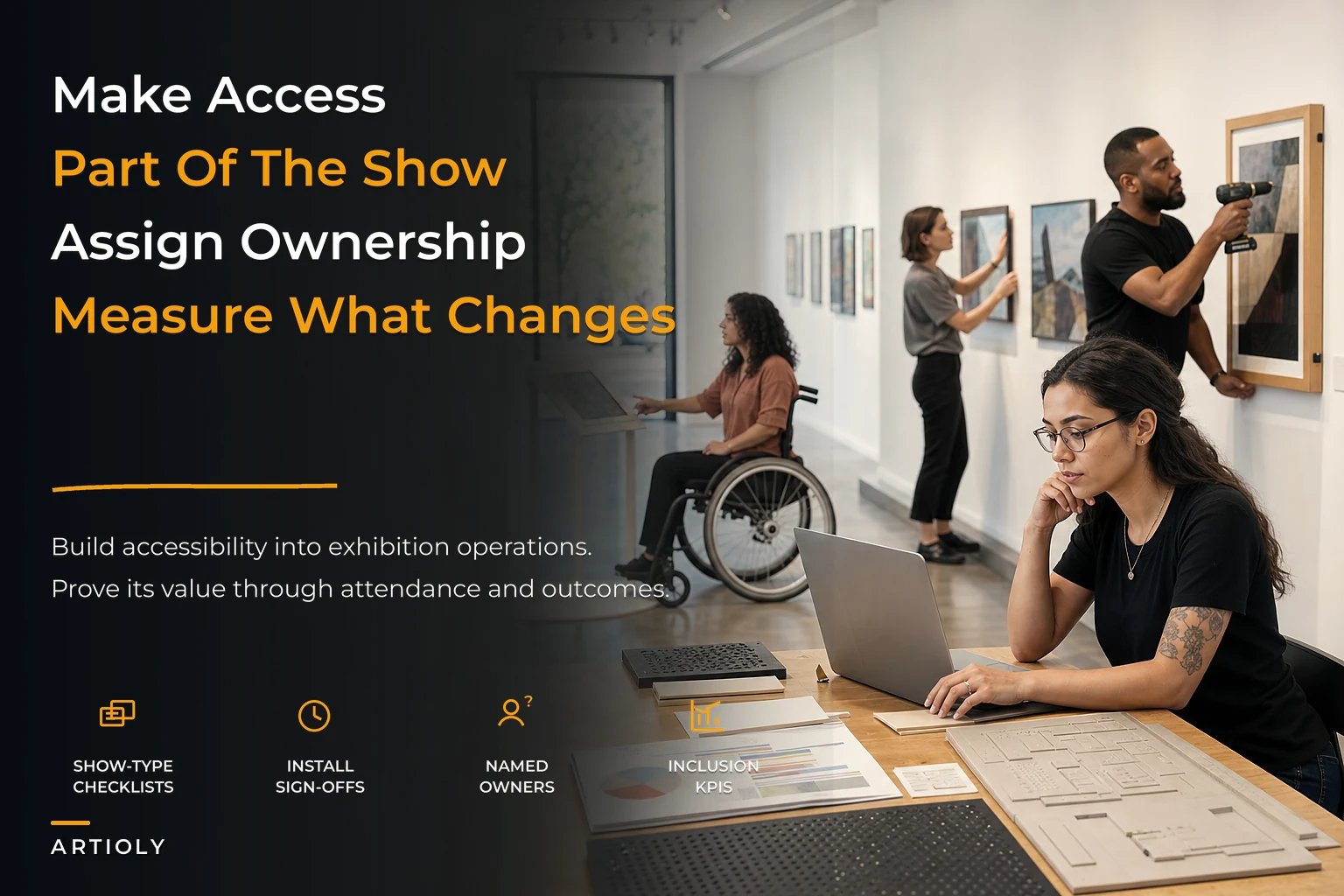

Most small galleries treat accessibility as a one-time compliance item. Someone builds a ramp, adds a line about "wheelchair accessible" to the website footer, maybe prints wall labels in a slightly larger font, and the topic gets shelved until a complaint or a grant application forces it back onto the table.
That's the pattern that breaks. Accessibility isn't a fixture you install once. It's a set of decisions that get made—or skipped—every single exhibition cycle, at the exact moments when your two-person team is already stretched thin hanging work, chasing loans, and prepping the opening. When it's not built into your production workflow, it disappears under deadline pressure. And when it disappears, you quietly lose visitors, funders, and the kind of reputation that brings school groups and community partnerships through the door.
This piece is about building a gallery accessibility system that actually holds up under a small team's real operating constraints—one where access decisions are tied to exhibition types, staffing roles, and the same KPIs you already track for attendance and program outcomes. Not aspirational. Operational.
Why accessibility keeps falling off the workflow
Accessibility fails in small galleries for structural reasons, not because anyone lacks good intentions.
The first reason is timing. Access design gets planned last, if at all. By the time someone thinks about tactile interpretation or captioned video, the exhibition budget is spent, the wall text is at the printer, and the opening is nine days away. Access becomes whatever can be done for free in the final week—which is usually nothing meaningful.
The second reason is ownership. In a founder-run gallery, everyone owns a little and no one owns access specifically. The curator assumes front-of-house will handle visitor accommodations. Front-of-house assumes the curator built interpretation into the design. Neither happens.
Third—and this one's harder to argue against in a budget meeting—access looks like a cost with no visible return. It's easy to justify spending on framing or a better opening spread because you can see the effect. Access improvements feel invisible until you realize how much foot traffic, grant eligibility, and repeat visitation you've been leaving on the table.
What you see across a lot of small arts operations is that the galleries doing accessibility well aren't spending dramatically more. They've moved the decisions upstream, assigned them to specific roles, and connected them to numbers leadership already cares about.
Start with exhibition-type checklists, not a universal policy
A single blanket accessibility policy doesn't survive contact with reality, because a solo painting show and a mixed-media installation with sound have completely different access needs. The fix is checklists keyed to exhibition type, so the right questions surface automatically during planning—not after install.
| Exhibition type | Primary access risks | Baseline requirements | Low-cost additions |
|---|---|---|---|
| Solo 2D (paintings, prints) | Hang height, label legibility, glare | Large-print labels, seating, clear circulation path | 1–2 tactile reproductions, audio description of 3–4 key works |
| Group / salon-style | Crowding, dense hangs, wayfinding | Wider paths, numbered map, high-contrast signage | Printed "quiet visit" hours, downloadable large-print guide |
| Sculpture / 3D | Trip hazards, "do not touch" barriers | Clear floor space, defined viewing zones | Touch-permitted replicas, verbal description cards |
| Media / sound / video | Audio-only content, flashing imagery, dark rooms | Captions, seating, light-sensitivity warning | Transcript handouts, adjustable volume, a lit rest area |
| Installation / immersive | Uneven flooring, disorientation, sensory overload | Staff briefed on assisted entry, sensory warnings posted | Scheduled low-sensory hours, a companion policy |
The point isn't to do everything in every column. It's that a curator planning a media show gets prompted about captions and light warnings before the video is installed, not after a visitor with epilepsy has a problem in your dark room. The checklist forces the question at the design stage, which is the only stage where it's cheap to solve.
Attach these checklists to your exhibition production timeline. When a show type gets selected, its access checklist should populate the project automatically alongside the framing list and the press schedule.
Low-cost tactile and interpretation design that punches above its price
There's a persistent myth that meaningful access means expensive braille signage and professionally produced audio guides. For a small gallery, the highest-value interventions are usually cheap and repeatable.
Large-print guides are the single best return on effort. A printed booklet with all wall text at 18pt, high contrast, matte paper to kill glare, kept in a rack at the entrance. Costs almost nothing per exhibition and serves far more people than you'd expect—not just visitors with low vision, but older patrons, tired visitors, and anyone who'd rather sit and read than crane at the wall.
Audio description via QR code replaces expensive guide hardware. Record 90-second descriptions of your three or four anchor works on a phone, host the audio, print a small QR placard beside each. You've built a partial audio guide for the cost of an afternoon and some printing.
Tactile elements don't require every work to be reproduced. One or two 3D-printed or cast reproductions of key pieces—or raised-line prints of a signature image—can genuinely transform the visit for blind and low-vision visitors. And honestly, for most visitors. People gravitate toward things they're allowed to touch. Local maker spaces and art schools will often produce these cheaply as a collaboration if you ask.
Interpretation writing matters more than any device. Plain-language labels—short sentences, defined jargon, a clear "why this matters" line—help every visitor and cost nothing but editing discipline. The mistake galleries make is writing labels for the art-world insider and treating that as neutral. It isn't. Dense curatorial prose is its own access barrier.
A useful rule: if an intervention helps one specific group and improves the general visitor experience, prioritize it.
That overlap is where small budgets do the most work, and it connects directly to how you convert visitors into buyers through the engagement funnel—because clearer interpretation and a more comfortable visit keep people in the room longer.
Ticketing, concessions, and the rules that actually matter
Access pricing is where galleries create accidental friction. You want a small, clear set of concession rules that front-of-house can apply without hesitation—and without making anyone justify their needs at the desk.
-
Companion/support person tickets are free. If your show is ticketed, a visitor who needs an assistant to attend shouldn't pay double. This is standard practice and removes a real financial barrier.
-
Named low-sensory or "quiet" hours at least once per exhibition run—reduced lighting adjustments where possible, lower sound, fewer people. Publish these dates the moment the show is confirmed.
-
No proof-of-disability requirement for basic accommodations. Asking someone to document their disability to get a large-print guide or a companion ticket costs you goodwill and gains you nothing.
-
Clear refund/rebook policy for access-related cancellations, so a visitor whose needs weren't met isn't fighting for a refund.
Keep the rulebook to one page. If front-of-house has to interpret policy on the spot, they'll default to the most cautious—usually least accommodating—reading, and you'll lose the visitor. Clarity at the desk protects the experience. It's also worth aligning your access desk rules with the broader on-site conversion and front-of-house playbook so accommodations and sales conversations don't end up working against each other.
Assign the roles, or nothing happens
This is where most systems live or die. Access work that isn't assigned to a named person, with time budgeted, does not get done. "The team handles it" is how it disappears.
-
Access lead (usually the curator or director). Owns the exhibition-type checklist, signs off that access requirements are met before install is locked. Roughly 3–5 hours per exhibition cycle.
-
Interpretation owner. Writes or edits plain-language labels and large-print guides, coordinates any audio description. Often the same person who handles press, since it's writing-adjacent work.
-
Front-of-house access point. Knows the concession rules cold, manages companion tickets, handles day-of accommodations. This is a briefing responsibility, not a full role—maybe 30 minutes per show to get everyone current.
-
Production/install owner. Responsible for physical access during hang: circulation width, hang height, hazard clearance, seating placement.
Write these into your existing exhibition production plan as named responsibilities with hours attached. The moment access hours appear on the same sheet as install and framing hours, they get treated as real work rather than optional extras.
What it actually costs
Approximate numbers for a small gallery running six exhibitions a year:
-
Large-print guides
~$40–70 printing per show → roughly $300–400/year
-
QR audio description setup (phone recording + hosting + placards)
~$60 per show in staff time and printing → about $350/year
-
One or two tactile reproductions per show via a maker-space partnership
highly variable, but call it $150–400 per show when you commit to it → maybe $1,200–2,000/year across the full cycle
-
Staff time for access leadership and briefing
roughly 8–12 hours per exhibition. At a blended small-gallery rate, this is the largest real line item, but it's absorbed into existing salaries rather than new spend.
The hard cash outlay for a solid baseline sits somewhere around $2k–3k a year, most of it optional tactile spend you can scale up or down. That's the number to bring to your board when access gets framed as unaffordable—because most of the time, it isn't.
Tie it to KPIs, or it stays invisible
The shift that keeps access alive past the first enthusiastic year: measure it against outcomes leadership already tracks.
-
Attendance Track whether low-sensory hours and companion tickets bring net-new visitors. Even a small, steady stream of new households counts.
-
Repeat visitation Access improvements disproportionately drive return visits—people come back to places that felt comfortable. Watch your return-visitor rate around exhibitions where you invested in interpretation.
-
Program/education outcomes School and community group bookings often require documented access provisions. Track bookings you win because you could say yes to access questions on the application.
-
Donor and grant outcomes Many funders now score accessibility explicitly. Track grant eligibility unlocked and dollars won where your access documentation was part of the case.
-
Dwell time and conversion Clearer interpretation keeps people in the room longer, and longer visits correlate with more sales conversations. This ties access directly into your revenue story rather than letting it sit off to the side as a compliance line item.
Galleries that report access against these KPIs stop having the "can we afford this?" argument, because the spreadsheet answers it. Galleries that treat access as pure compliance keep relitigating it every budget season.
A short real scenario
A two-person contemporary gallery running about eight shows a year kept getting turned down for two regional arts grants, both of which scored accessibility. They'd never lost the grants on access alone, but it was dragging their applications into the "maybe" pile.
They didn't overhaul anything dramatic. They built exhibition-type checklists, committed to large-print guides every show, added QR audio description for anchor works, ran one published low-sensory afternoon per exhibition, and made companion tickets free. Total new hard spend landed around $2,400 for the year. Staff time was reallocated, not added.
Within roughly a year, they won one of the two grants—a low-five-figure award—started getting school-group inquiries they could actually say yes to, maybe four or five new bookings across the year, and noticed their return-visitor rate ticking up around the shows with the strongest interpretation. Nothing explosive. But the access line stopped being a liability in funding conversations and turned into a small, real contributor. That's the whole point.
Where a system beats a checklist
Checklists solve the memory problem. They don't solve the coordination problem.
As you scale from six shows to twelve, or add a second space or a satellite program, the failure mode changes. It's no longer "we forgot"—it's "the curator thinks it's done, front-of-house wasn't briefed, and the large-print guide never got reprinted for the new hang." That's a coordination failure, and no individual checklist catches it.
At that point the value is in one connected record—exhibition type, its access checklist, the named owners, sign-off status, and the KPIs it feeds—living in the same place you already manage exhibition production, ticketing, and donor reporting. An operational platform earns its keep here: not by doing the access work for you, but by making sure the checklist auto-populates when a show type is chosen, the right person gets the task, sign-off can't be skipped before install locks, and the attendance and grant outcomes tie back automatically for your board deck. The same logic that governs your collector lifecycle stages and stewardship cadence applies here—access is a lifecycle with owners, gates, and measurable outcomes, not a one-off gesture.
A simple workflow looks like this.
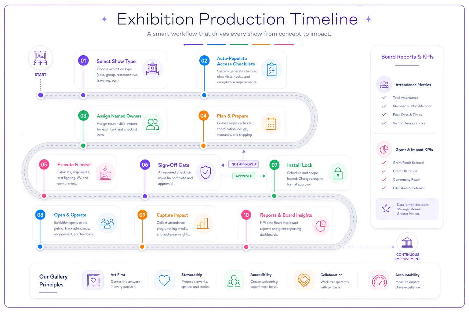
When access lives inside the workflow instead of beside it, it survives staff turnover, deadline crunches, and budget season. That's the difference between a gallery that has an accessibility policy and one that actually runs an accessibility system.
When to keep it lean, and when not to bother yet
Not every gallery needs the full build immediately.
When a lean version makes sense: You're running fewer than four shows a year with a solo or duo team. Start with large-print guides, plain-language labels, free companion tickets, and one published quiet period. That covers most of the return for almost no cost.
When to invest in the full system: You're at six-plus shows a year, applying for grants that score access, courting school and community partnerships, or running more than one space. The coordination cost is now real, and a connected system pays for itself.
Who should hold off: If your exhibition schedule is chaotic and you don't yet have a stable production timeline to attach checklists to, fix that first. Access checklists bolted onto a nonexistent workflow just become another thing to forget. Get the production rhythm stable, then layer access ownership into it.
Accessibility done as a system isn't about doing dramatically more. It's about deciding access at the moment it's cheap to decide, assigning it to someone by name, and measuring it against the numbers your gallery already lives by. Do that, and it stops being the thing that gets cut—and starts being the thing that quietly brings people in.