

Most small galleries hang a show based on instinct, a floor plan sketched on printer paper, and whatever the curator remembers from the last opening. Then the show runs for six weeks and nobody actually knows which wall pulled people in and which one they walked past on the way to the bathroom. You have a guest book, maybe a rough door count, and a vague sense that "the back room felt dead."
That gap — between what you think happened on the floor and what actually happened — is where a lot of curation money quietly leaks. You re-hang the same way next time. You give your strongest work the wrong wall. You keep a slow layout because nobody proved it was slow.
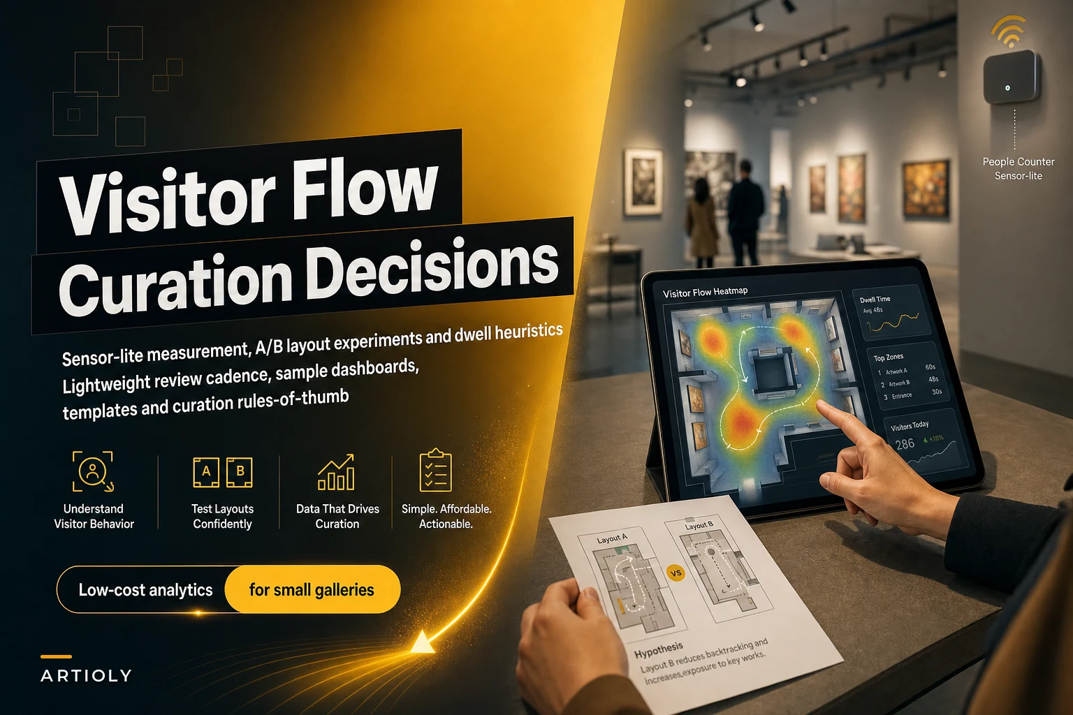
You don't need a museum-grade people-counting system or a data scientist to close that gap. You need a gallery visitor flow analytics setup that's deliberately sensor-lite, cheap to run, and honest about being approximate. This post walks through how to build one, how to run layout experiments against it, and how to turn the results into actual hang decisions instead of charts nobody reads.
Why galleries fly blind on visitor flow (and why fancy sensors aren't the answer)
The instinct when someone says "measure visitor flow" is to go buy hardware. Thermal counters, ceiling-mounted cameras, Bluetooth beacon kits. Then you look at the pricing, the install, the privacy questions, and the fact that your gallery is a converted storefront with weird sightlines, and the whole thing dies in a spreadsheet.
Galleries that go straight for precise measurement usually end up measuring nothing, because the setup is too heavy to sustain. A volunteer forgets to turn the counter on. The camera feed gets ignored. Six months later you're back to eyeballing it.
The other failure mode is the opposite — pure vibes. The curator "knows" the corner piece is the anchor because a few collectors mentioned it at the opening. But openings are a terrible sample. The people there are self-selected, drinking wine, moving in social clusters. What happens on a quiet Wednesday afternoon with three walk-ins is completely different, and that quiet traffic is often where actual sales conversations start. We dug into the opening-night distortion more in the on-site conversion flow playbook.
The sensor-lite stack: what to actually track
Forget precision to the individual. You're not building surveillance, you're building a signal. Here's the minimum viable data set that's proven useful for small galleries.
| Signal | How to capture it | Cost | Effort |
|---|---|---|---|
| Door count (entries) | Cheap infrared beam counter or manual clicker at desk | $20–$60 | Low |
| Dwell zones | Front-of-house tally sheet, 4–6 zones marked on a floor map | Free | Medium |
| Path/first-turn | Staff notes: "which way did they go first?" | Free | Low |
| Stop points | Post-it dots on a printed floor plan per shift | ~$5 | Low |
| Time-of-day pattern | Timestamp on entries | Free–low | Low |
| Conversation triggers | Staff log: which piece started a real question | Free | Low |
Notice what's not on there. No individual tracking, no heatmap camera, no per-visitor journey. You're building a heuristic heatmap — a rough density picture — not a scientific one. And that's fine, because curation decisions are directional, not surgical.
The trick that makes this sustainable is turning it into a physical ritual. One printed floor plan per shift, taped to a clipboard at the desk. Whoever's working puts a dot near any piece where someone clearly stopped and looked for more than a few seconds. At the end of the day, snap a photo of the sheet. That's your data capture. It takes the desk person maybe two minutes an hour, and unlike a sensor, they also catch context — "big group came in for the mural, ignored everything else."
Put the printed floor plan on a clipboard at the desk so staff can dot it quickly.
Over a two-week window you'll have somewhere around 20–30 dotted floor plans. Stack them, and the dense clusters and the dead zones jump out immediately. That's your baseline heatmap, built for the price of a pad of Post-its.
Turning the floor into an A/B experiment
Once you have a baseline, you stop guessing about layout and start running actual experiments.
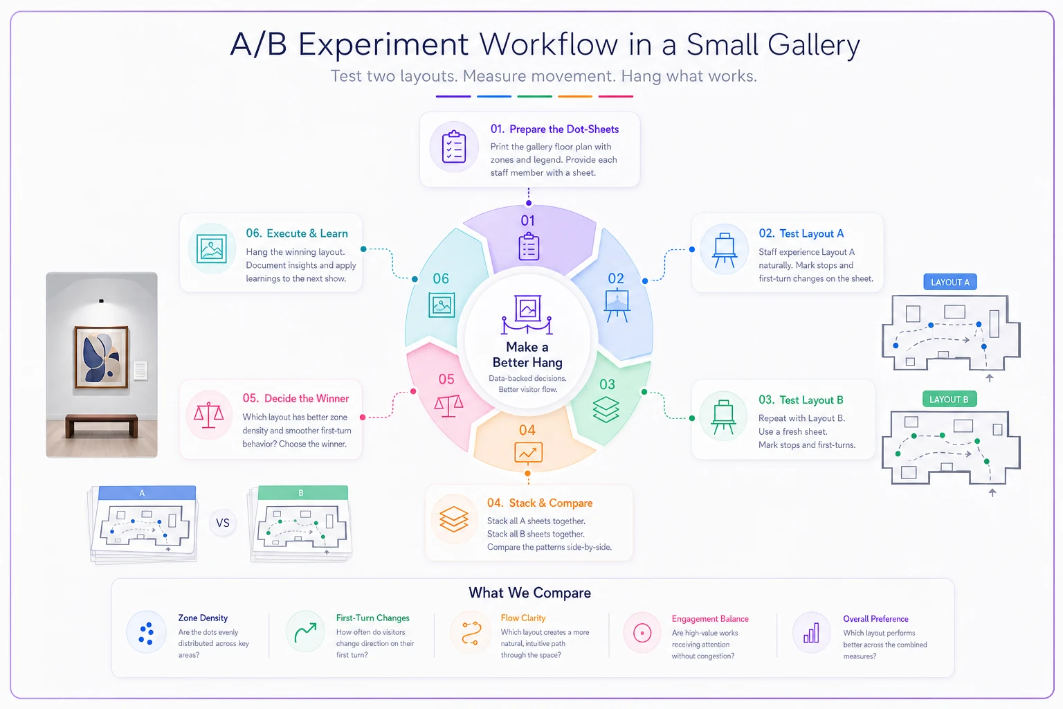
The concept is simple: change one thing, measure the same way, compare. The discipline is in changing one thing. Galleries love to re-hang everything at once, which means you learn nothing about why the numbers moved.
-
Pick one variable. Examples
the piece on the "power wall" (first thing seen entering), the height of a hanging line, the placement of price/label info, whether the back room has a sightline anchor.
-
Define the hypothesis in one sentence. "If we move the large abstract to the entry wall, first-turn traffic into the back room will increase."
-
Set the measurement window. Two weeks per variant is usually the floor for a low-traffic gallery. Less than that and daily noise drowns the signal.
-
Hold everything else constant. Same hours, same staffing, same lighting. Don't launch a variant the same week you send a big email blast — you'll contaminate the traffic.
-
Capture with the exact same dot-sheet method.
-
Compare zone density and first-turn splits, not just door count.
A realistic example of what this surfaces: one gallery believed their entry piece was doing its job because it got a lot of dots. But the dot-sheets showed that people stopped there, looked, and then left — the entry piece was a terminus, not a funnel. It pulled attention but killed momentum into the rest of the show. Swapping in a smaller, more curious piece that raised questions instead of resolving them pushed noticeably more people deeper into the space. Same door count, completely different flow.
Here's a simple workflow for running an A/B variant.
You'd never catch that from a guest book.
Dwell vs. stops vs. sales: don't confuse the signals
A big mistake with flow data is treating "attention" as if it means "value." They're not the same thing.
-
Dwell — total time in a zone. High dwell can mean fascination or confusion — people standing there because the wayfinding is broken and they don't know where to go next.
-
Stops — discrete pauses at a specific work. This is closer to genuine interest.
-
Conversation triggers — pieces that made someone actually ask a question or walk to the desk. This is the signal that correlates most with real sales intent.
The piece with the most dots is often not your best sales asset. A visually loud piece near the entrance racks up stops because it's impossible to miss. Meanwhile a quieter work in a well-lit alcove generates fewer stops but a much higher rate of "wait, tell me about this one." When you map stops against conversation triggers, that ratio — questions per stop — tells you which works are punching above their visual weight.
That's exactly the kind of signal that should feed your curation hypotheses rather than just your hang aesthetics. If you're already treating curation as something to test rather than decree — which we dug into in treating curation as a hypothesis — flow data becomes the cheap experiment layer underneath those bigger curatorial bets.
A lightweight review cadence that actually happens
The reason most gallery measurement dies isn't the capture — it's that nobody looks at the data on a schedule. It piles up and becomes a guilt object. The cadence has to be small enough to survive a busy install week.
Here's a review rhythm that holds up in real small-team operations:
Weekly (15 minutes, at the desk): Flip through the week's dot-sheets. Note anything obvious — a dead zone that stayed dead, a surprise cluster. No decisions yet, just observation. Photo-archive the sheets.
Per-experiment (30–45 minutes): At the end of each two-week variant, compare the stacked sheets against the previous variant. Ask three questions: Did first-turn behavior change? Did any dead zone come alive? Did conversation triggers shift? Write the answer in two or three sentences and file it.
Per-show (1 hour, at teardown): Before you touch the walls, do a flow debrief. Which walls consistently underperformed regardless of what hung there? That's an architecture problem, not an art problem — a lighting gap, a bad sightline, a corner people structurally avoid. Those findings carry to every future show, which is where the real compounding value is.
The show-level debrief is the one people skip and the one that pays the most. Wall-level truths persist. If the far-left wall dies under three completely different shows, stop blaming the art. Fix the wall, the lighting, or the path that leads people away from it.
A real scenario: the dead back room
The gallery: A two-person contemporary space, roughly 1,400 sq ft, split into a bright front room and a smaller back room. Foot traffic around 180–220 walk-ins a month outside of openings.
The problem: The back room felt dead every show. The owners assumed the art back there was weaker, so they kept putting their least-favorite works in it — which of course made it deader. A self-fulfilling prophecy.
What the flow data showed: Over three weeks of dot-sheets, only about one in five visitors turned into the back room at all, and most who did entered, glanced, and reversed out within seconds. The sheets made it obvious the problem wasn't the art — it was the entry to the room. From the main space, the doorway framed a blank patch of wall. There was no reason to walk toward it.
The experiment: They ran a two-week A/B. Variant A: existing setup. Variant B: they hung a single striking, colorful piece on the exact wall visible through the doorway — a visual "come here" magnet — and left everything else identical.
The result: Back-room entry went from roughly one in five to a bit under half of visitors. Time spent back there jumped, and the desk started logging real conversations about works that had been sitting ignored for months. Two of those pieces sold that quarter after a long stretch of nothing.
Total cost of the intervention: a Post-it pad, a printed floor plan, and moving one artwork. No sensors, no consultants.
When this makes sense — and when it doesn't
When it's worth it:
-
You run multiple shows a year in the same physical space, so wall-level findings compound.
-
You have at least modest steady traffic (100+ non-opening visitors a month) — enough for patterns to emerge over two weeks.
-
Someone on staff can own the two-minutes-an-hour ritual without resenting it.
When it's a bad idea:
-
Pop-up or one-off spaces where you'll never re-use the layout. You'll learn things you can't apply.
-
Ultra-low traffic (a dozen visitors a week). The signal is too thin; you'll be reading noise as insight.
-
If you're going to collect dot-sheets and never do the review cadence. Data you don't look at is just clutter with extra steps.
Who should not bother: Galleries that already have a working, disciplined flow-review habit and are hitting the ceiling of what heuristics can tell them. At that point you've earned the case for actual sensors — you know exactly what question you're trying to answer, which is the only time sensor spend pays off.
Where software quietly earns its place
None of this requires software to start — the whole point is that a clipboard works. But there's a natural ceiling to paper. Once you've got a few months of dot-sheets, comparing experiments by hand gets tedious, and the show-level findings live in someone's memory instead of anywhere searchable.
That's where a lightweight operational platform helps — not by replacing the human observation, but by holding it. Logging each experiment's hypothesis and result, keeping stacked heatmaps searchable, flagging when a wall has underperformed across multiple shows, and mapping flow patterns against your sales and conversation logs so the curation signal and the revenue signal sit in the same place. The measurement stays cheap and human on the floor; the memory and the comparison get handled so nothing gets lost between shows.
The mistake is buying that layer first. Build the ritual, prove it changes decisions, then let software carry the parts that are annoying to do by hand.
The point isn't the data — it's the decision
A dot on a floor plan is worthless on its own. It becomes valuable the moment it changes where you hang the next show, which wall you fix, or which quiet piece you finally give a real chance. The galleries that get value from gallery visitor flow analytics aren't the ones with the fanciest tools — they're the ones who tied a two-minute ritual to a review cadence and let the floor tell them what their instincts couldn't.
Start with one printed floor plan and one honest question about your space. Run one experiment. Change one wall. The data doesn't need to be perfect to be better than guessing — and right now, most galleries are still guessing.
Start with one printed floor plan and one honest question about your space. Run one experiment. Change one wall. The data doesn't need to be perfect to be better than guessing — and right now, most galleries are still guessing.